Color Rhythm
Cream and white sections are balanced by sage green surfaces and yellow accents.

Rasvati
Preparing your table

Rasvati
Preparing your table
A visual guide for keeping the site warm, premium, Indian vegetarian, and consistent.
The system uses a few strong ingredients: color, typography, pattern, imagery, and consistent CTAs.
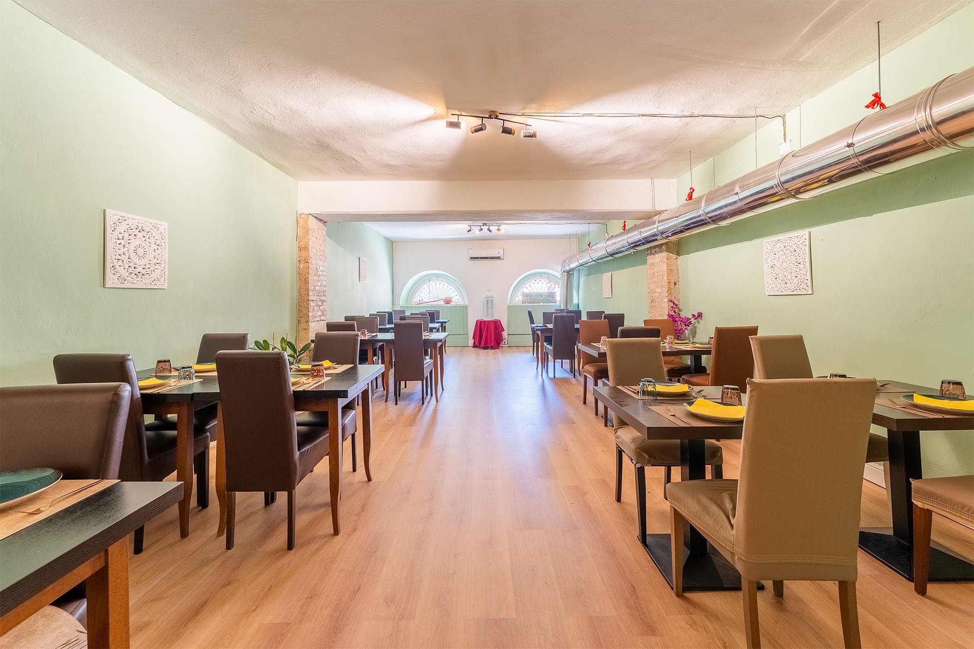
Cream and white sections are balanced by sage green surfaces and yellow accents.
Noto Serif Devanagari leads all premium headings while Montserrat keeps body text crisp.
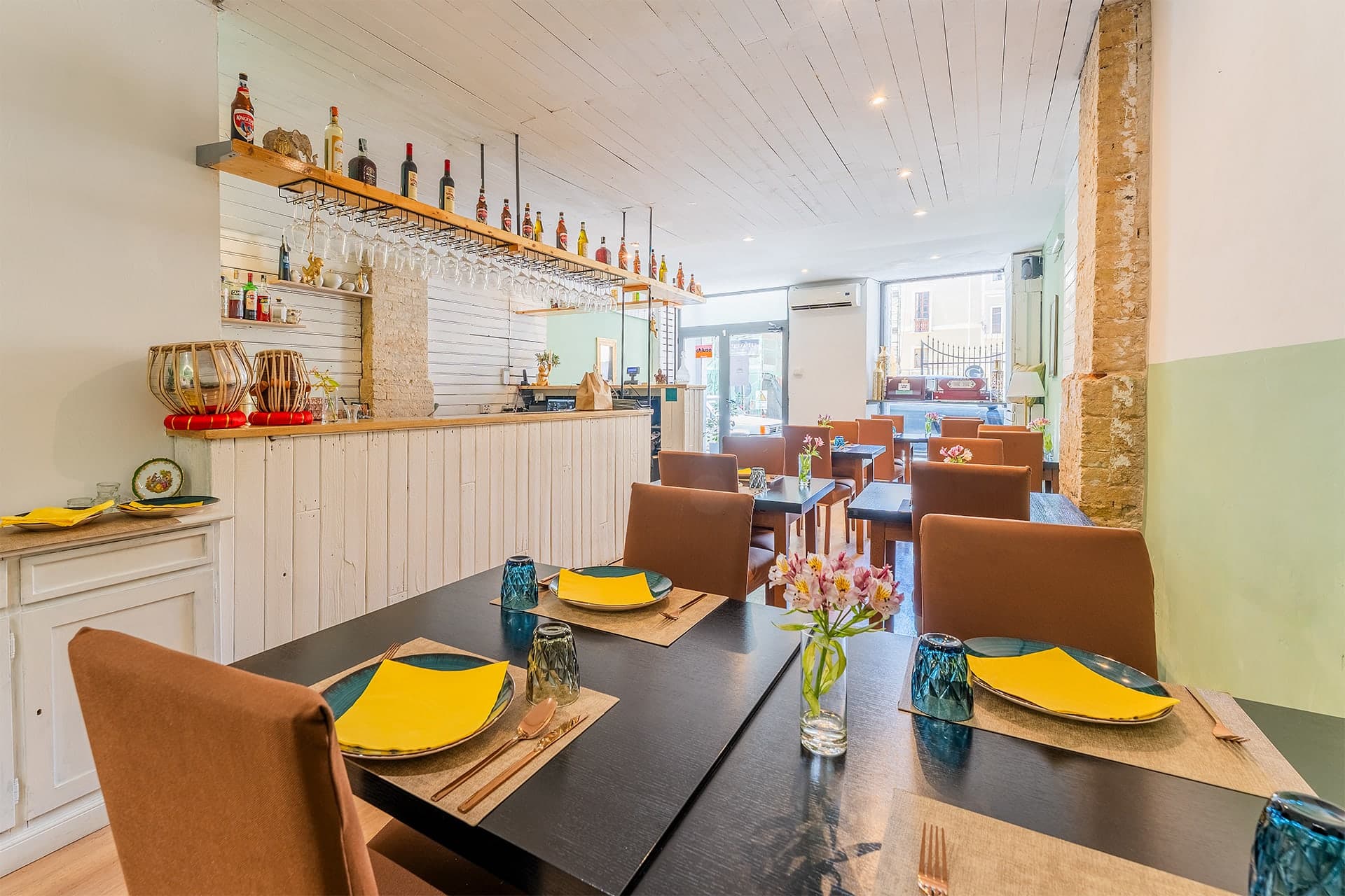
Large imagery, layered cards, refined borders, and generous spacing create the restaurant mood.
CTAs are direct, tactile, and repeated at natural moments across the journey.
Yellow stays as a conversion accent, not as body text on light backgrounds.
#eecb2f
Primary CTA, dividers, small premium highlights
#73937b
Main brand tone, calm surfaces, supporting accents
#dfe8d8
Light panels, calm background tints, gentle section rhythm
#10130f
Luxury contrast, headline overlays, dark cards
#fff8eb
Editorial page backgrounds and soft panels
#ffffff
Cards, forms, clean reading surfaces
Headings should feel warm and refined. Body copy and controls should stay clear and readable.
Rasvati
Indian vegetarian flavour in a room that welcomes.
Montserrat supports body copy, navigation, buttons, labels, forms, and compact detail text.
These elements create consistency across home, about, events, contact, and reservations.
Dark image overlay, large serif headline, compact proof points, and primary booking actions.
Glass-like contact, hours, and booking cards overlapping the hero on larger screens.
Image-led card with refined border, price badge, hover lift, and generous description space.
Sage surface, restrained icon use, readable dark text, and celebration-focused copy.
Large labeled fields, warm sage image backdrop, gold submit button, and clear feedback.
Brand block with pattern, logo, quick links, address, hours, and social actions.
Controls should be large, accessible, consistent, and easy to use on mobile.
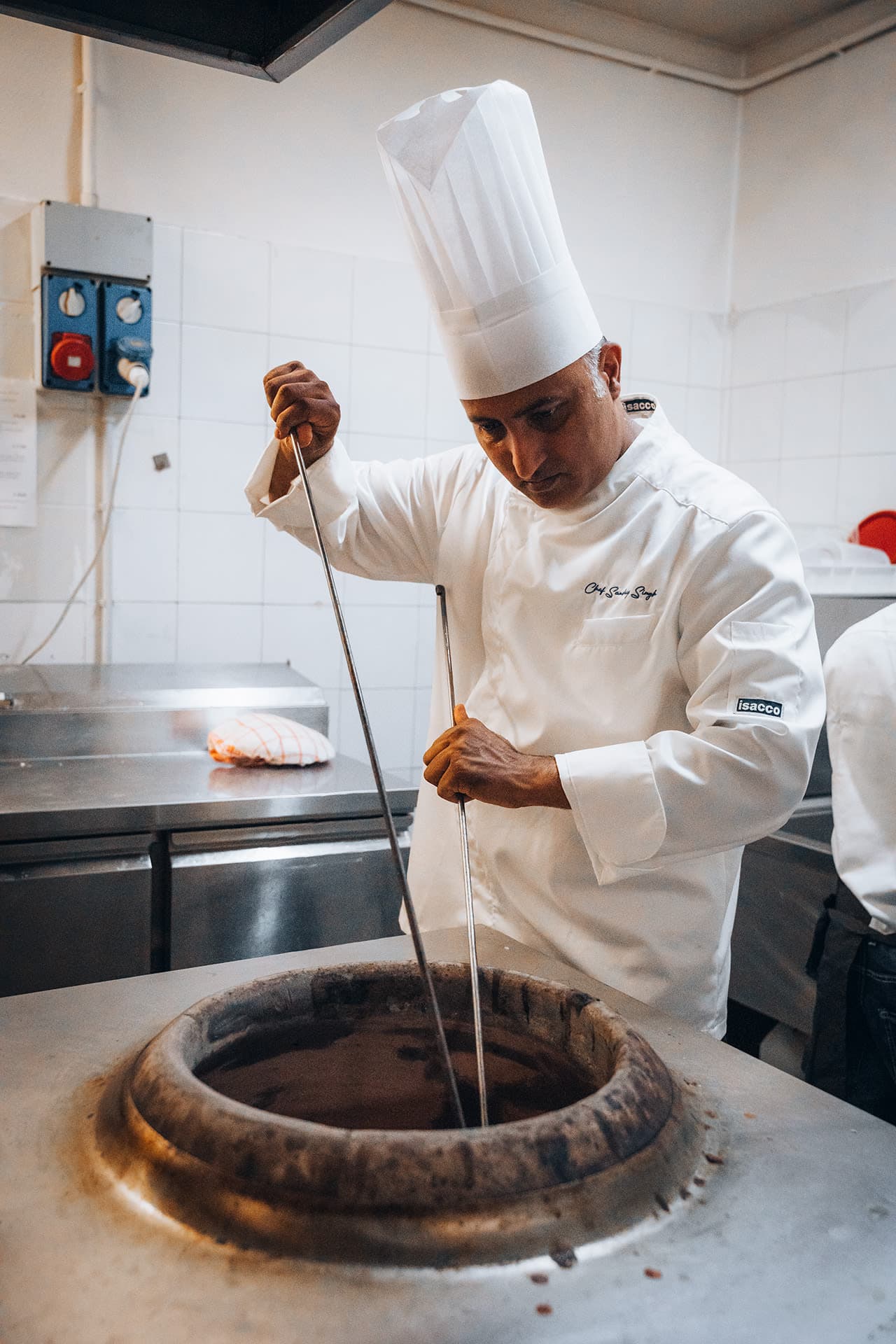
Restaurant imagery should carry the emotion. The floral pattern stays subtle and secondary.